Navigator for i Graph History: Review Historical Data
IBM i expert Dawn May continues her series about Navigator for i by discussing historical data

In the article Navigator for i Graph History: Enable Historical Data Collection, I reviewed how to enable Collection Services to create historical data. Once you have enabled the collection of historical data, you will have the ability to view this data. This support allows you to view trends over long periods of time – days, weeks, and even years.
View Historical Data in Navigator for i
You view your historical data in Navigator for i using the following navigation: Performance → Graph History. In general, you start with the Summary perspective. The Summary perspective initially displays CPU Utilization (Average) for the past month.
You can customize the information you want to display with the Context panel, which is shown in Figure 1:
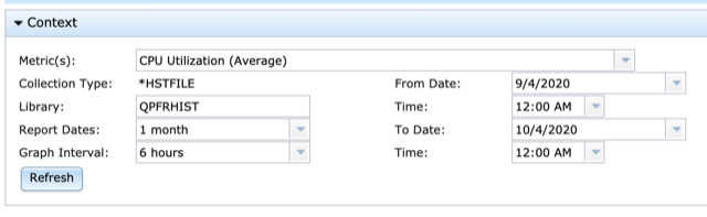


The first drop down is Metrics. This allows you to select which metric you want to review and there are several metrics that have historical data collected for them. You can also select report dates and times with the various options available. Finally, you can select the interval at which the data is to be charted. Once you have your options selected, simply click Refresh to display the chart you customized.
When you have displayed the metric of choice for the desired timeframe, you can interact with the chart in various ways. You can zoom into timeframes of interest; if the underlying detailed information is available, you can click on the data point to see that detailed data. For example, for CPU Utilization, you can see information about contributing jobs and you can review the properties for a particular job.
Graph history also has a feature called Stacked Charts. You access Stacked Charts by clicking on the icon with two chart arrows, shown in Figure 2:
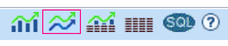
Stacked Charts allow you to display historical data day-by-day, week-by-week, or month-by-month. Stacked charts are displayed based upon the time frame that you have selected to view from the Context panel. For example, if you display one year of data, stack charts will display that metric for each month. Stacked charts are useful for critical applications that run at specific intervals and you want to compare trends from one timeframe to another.
This post just touches upon the key features of Graph History. Access the references below for more information:
- Graph History in IBM i Technology Updates
- A new way to analyze historical performance data on IBM i
- Graph History in the Knowledge Center
- Graph History – Stacked Charts
- Graph History – New in 7.3 IBM Navigator for i
- RFE: Collection Services Historical Data Should be created by default